UX/UI expert: 20 years of experience with Design Principles
Design Principles are not a set of rules you write once and then tick off. They shift with technology, devices and what users are used to.
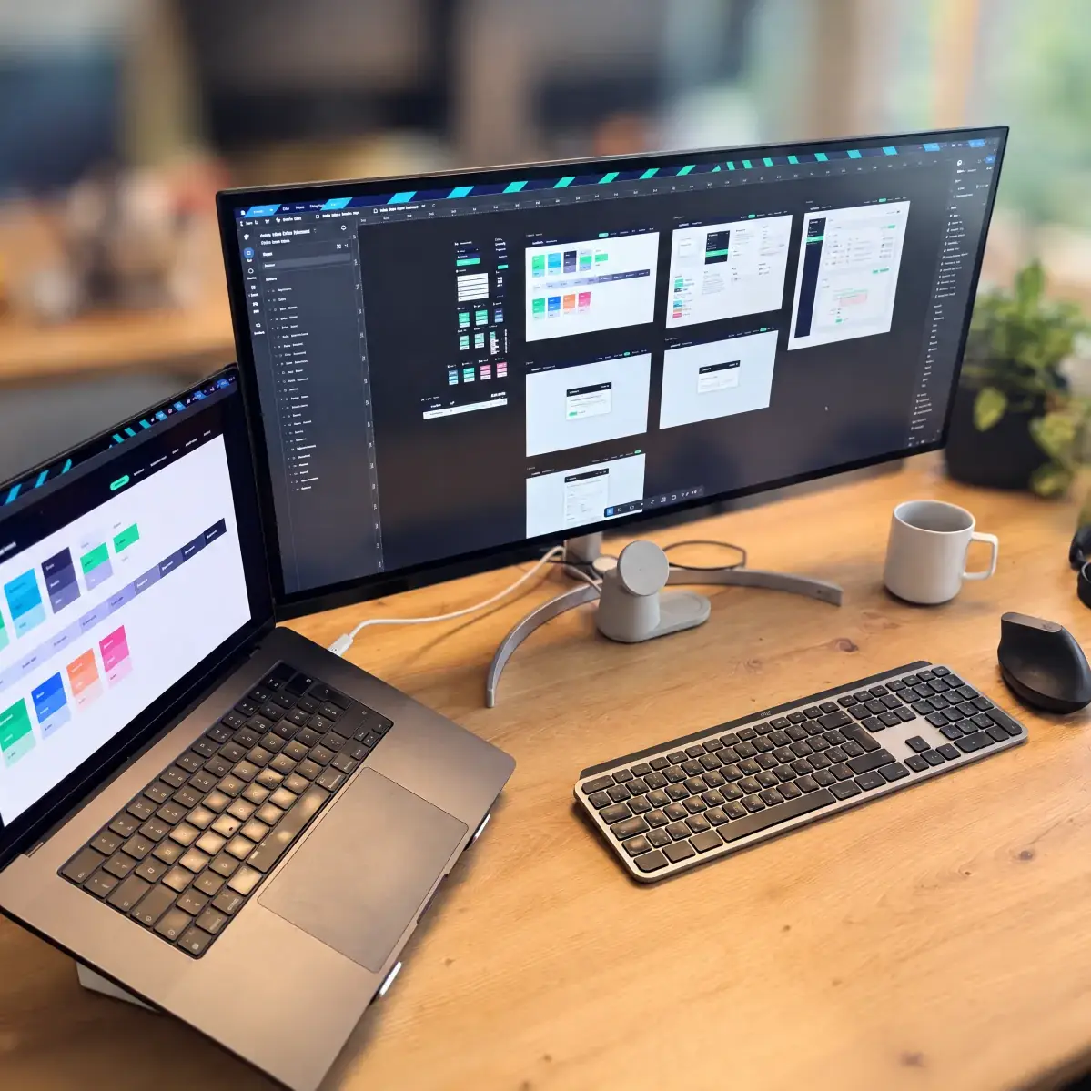
Urs Imhof, CXO at cloudtec, has been working on user interfaces for a good 20 years. We asked him what has changed in that time, how he approaches a new project and what he works with today.
Who is Urs?
Urs takes care of the digital user experience. He conceives and designs user interfaces, from structure and interaction to colour, form and typography. His subject is the combination of function and aesthetics: interfaces that not only look good but are also easy to use. Away from the screen, dogs and music are part of his life.
From animated GIFs to design systems
Urs started out with websites for the bands he played drums in himself. After his commercial apprenticeship, he joined the e-solutions department of his employer at the time. The internet ran over the telephone line, pages consisted of text and the occasional image, and there was a handful of fonts to choose from. Then came animated GIFs and guestbooks, later frames and layouts built from HTML tables. Mobile devices did not exist, and so neither did responsive design.
Next came a detour into Flash. Animation was suddenly possible, but the sites were self-contained, loaded slowly and began with intros nobody wanted to watch. Adobe finally discontinued Flash Player at the end of 2020. After that, development moved via video and ever more mature HTML and CSS foundations to the usability standards we follow today.
How a new project starts
Technically, almost anything is possible today; complex layouts would be easier to implement than ever before. At the same time, knowledge of what works and what does not has grown. In professional projects, we therefore rarely reinvent the wheel: the navigation is where people expect it, not suddenly at the bottom left. We design mobile first, and the navigation pattern depends on the scope and structure of the platform. Then there is the client’s corporate design. The more complete it is, the faster a sound basic framework is in place.
Between tool and stage
Whether an interface strengthens your brand comes down to three questions: How is the corporate design set up? What does the target group need? And how tech-savvy are the future users? The more complex the functionality, the more the interface has to cushion. Every product sits somewhere between pure tool and emotional presentation, and the layout must reflect that position. The range extends from plain and uncluttered to large-scale and animated.
What we work with today
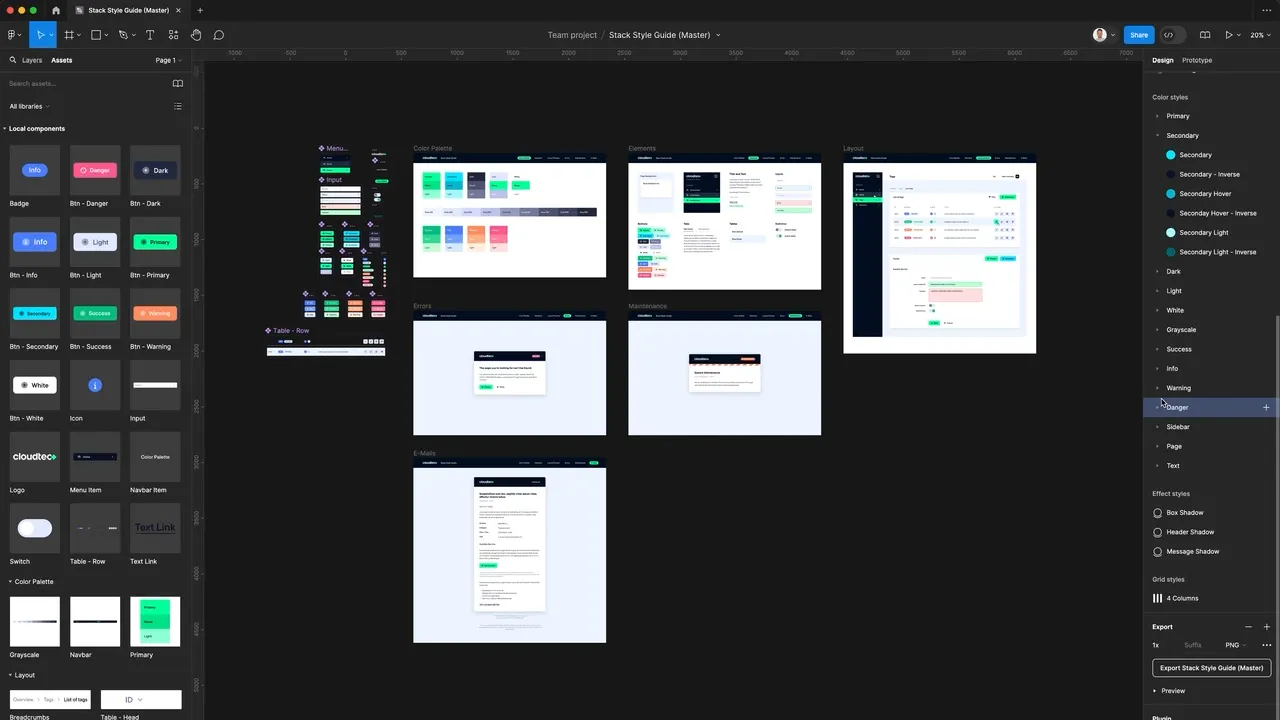
For UX design, we rely on Figma: it is close to development, has a large choice of plugins, and in platform development, with its extensive design systems, component libraries, variable collections and local styles pay off immediately. For illustration, image editing and moving images, we still use Adobe products as well: Illustrator, Photoshop, After Effects and Premiere.
What comes next
User-centred principles remain the benchmark: every interaction should work without having to think. Artificial intelligence mainly shifts production: variants, interim versions and prototypes are created faster. The decision about which of them holds up stays with the team. And usage continues to shift towards app logic: platforms increasingly feel like products, not like websites.
These are the topics occupying us in the short to medium term:
- Artificial intelligence: in the creation process and as a function in the product itself.
- Progressive web apps for applications that should feel like native apps, without the detour via an app store.
- Dark mode, so that the layout adapts to the operating system setting.
- Motion design and micro-interactions as feedback on an action, not as decoration.
 Written by
Christian Knellwolf
CEO