Skip to content
Language
DE EN FR
Start a project

Complex platforms, easy to use

User-centred design for complex business platforms, with user research, prototypes and a design system of their own. Ready to implement on the cloudtec Stack, not just as a mockup.

The illustration shows a layout framework whose grey wireframe blocks turn one after another into designed, coloured areas. Only the structure column remains as a grid.

Starting point

From problem to interface

Good design starts with understanding, not drawing. On complex platforms with many roles, processes and domain logic, user guidance decides acceptance and efficiency.

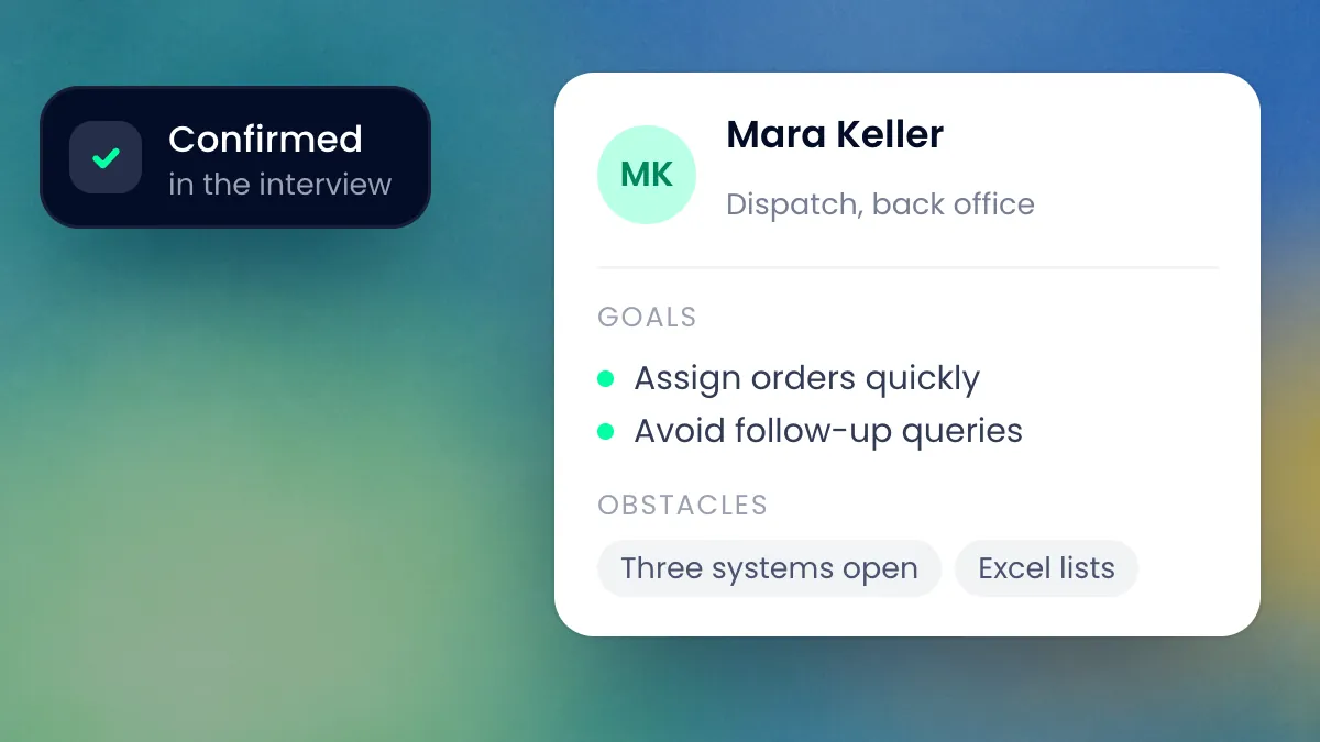
A persona card from dispatch with goals and obstacles, next to it the note that the assumption was confirmed in an interview.

User research

Identify target groups, understand usage scenarios and existing processes, sharpen personas. For internal applications, structured assumptions that we test on the prototype are often enough. For customer-facing portals we invest in real user interviews and usability tests. The basis is our user-centred approach: decisions are made with results from tests, not with untested assumptions from the workshop.
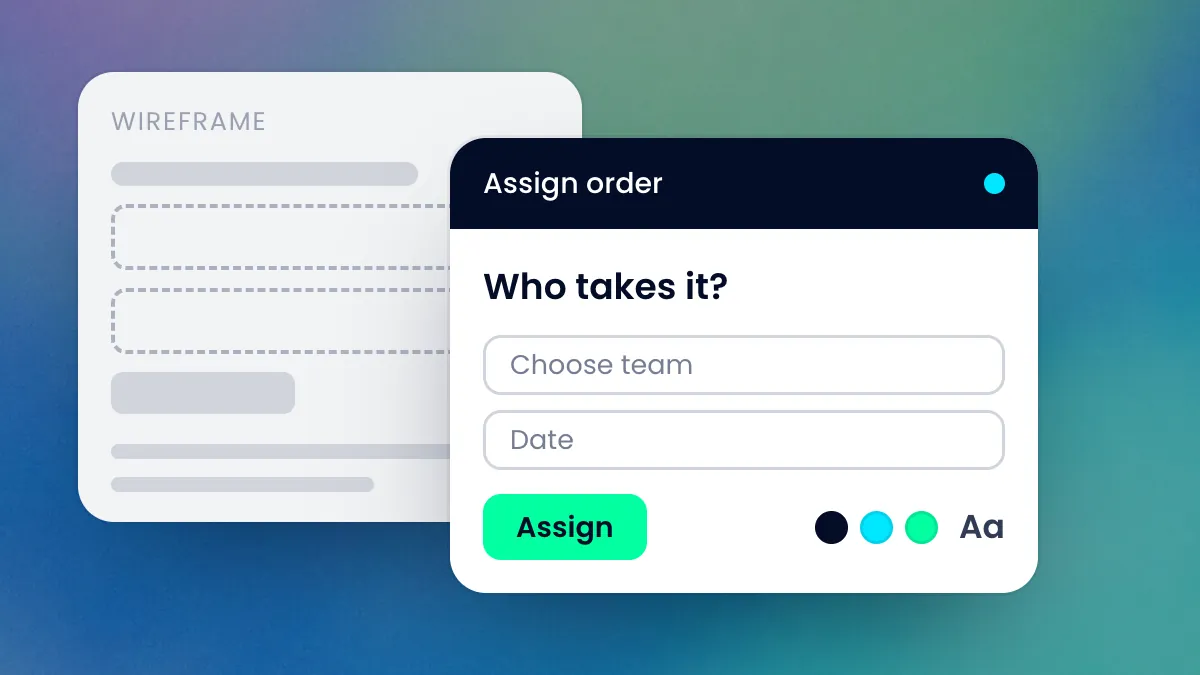
A grey wireframe and next to it the same dialogue in its finished design, with input fields, button and colour swatches.

UX design

Information architecture, user stories and user flows: structure before colour, and before a line of code is written. Wireframes become the visual design, aligned with your brand. Typography, colour system and interaction patterns form a consistent foundation. Responsive from the first draft.

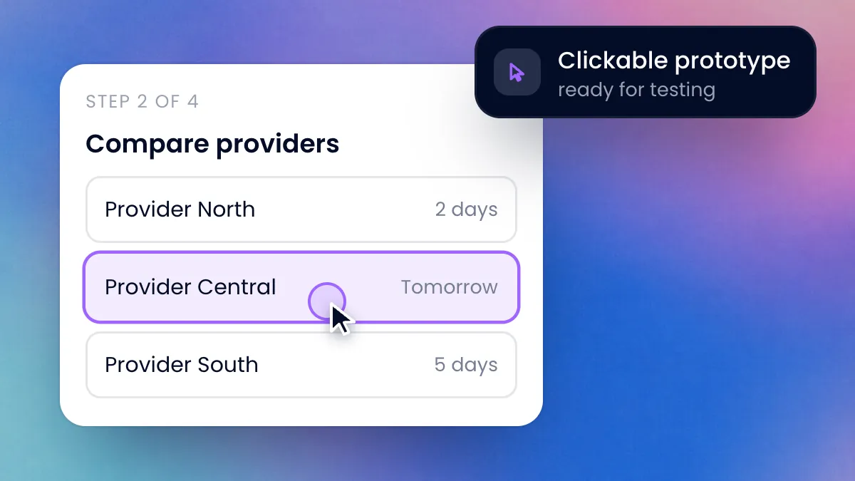
A clickable prototype at the second of four steps: the mouse pointer selects one of three providers.

Prototyping

Clickable prototypes in days, working ones in a few weeks. You see and click through your platform before we develop it. Early tests with real users validate assumptions. Costly wrong decisions show up while they are still cheap to correct.

Consistency & accessibility

So that the design does not fall apart in operation

Individual views quickly become inconsistent, and accessibility cannot be retrofitted. With us, both are part of the architecture: ready to implement on the stack, without throwaway mockups.

  • Accessibility: contrasts, font sizes and interactive elements according to WCAG guidelines, from the start. For public and regulated platforms alike, this is increasingly mandatory.
  • Design systems: reusable components (buttons, forms, cards, navigation) as a shared language for design and development. They build on Stack UI, our own UI framework. Prototypes are created with AI directly in the stack’s code: what you click in the prototype is already the component that goes live. After launch, user feedback feeds into regular optimisation cycles.

The graphic shows a design system schematically: on the left are the tokens for colour, spacing, radius and focus. When a token changes, desktop, tablet and smartphone adopt the change at the same time. Then the keyboard focus moves from the input field to the button, and the contrast check is passed.

Case studies

Design that is in production

Three platforms with many roles and processes. Here, user guidance decides acceptance.

Healthcare · Platform

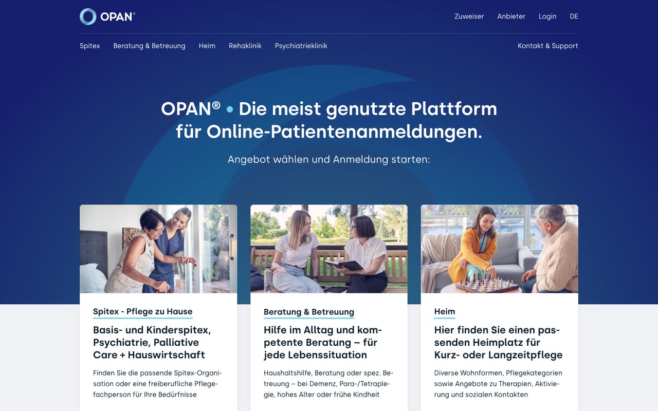
e-health platform OPAN®

Referral platform for aftercare: hospitals, practices and private individuals register patients with Spitex, care homes and clinics and see available capacity.

View case study: OPAN®
Healthcare · Platform

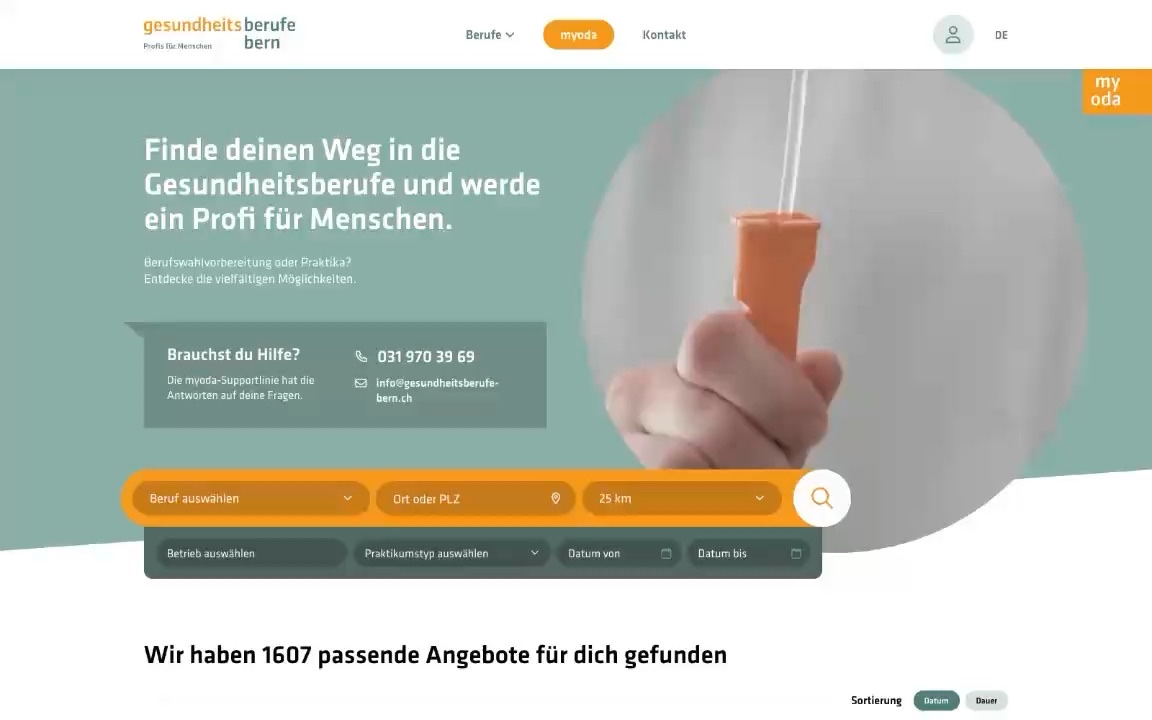
myoda applicant platform

Applicant platform for healthcare professions: find taster days and internships, maintain your own profile and apply directly to employers.

View case study: myoda
Leisure & tourism · Platform

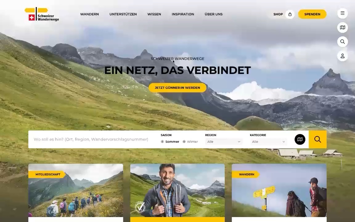
Swiss Hiking Trail Federation

Website, CMS and user account for the umbrella organisation: trilingual, with swisstopo maps, an online shop and 26 cantonal organisations on one foundation.

View case study: Swiss Hiking Trail Federation

Good design starts with a conversation

Whether it’s a new platform or a redesign: talk to our design team about your requirements.